U.S. Power Generation
Twenty-six annual snapshots of every EIA generator reproduce EIA’s own published capacity series to within 0.011%.
Question
A single snapshot of the grid answers where capacity sits today. I wanted to see how it got there — which fuels arrived when, which retired, and whether that shape holds up against EIA’s own numbers.
Function
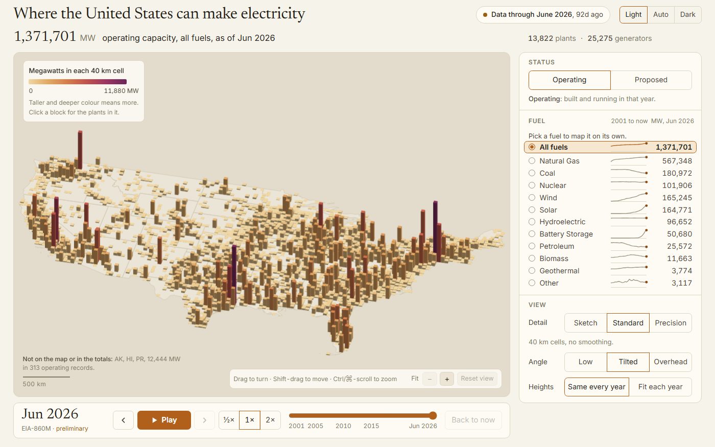
Bins every EIA generator from 2001 to the current monthly filing into 10-kilometre equal-area cells and extrudes them as a relief; a year slider or a Play button rebuilds the country one year at a time — coal rising and then falling after 2010, wind marching up the Plains, solar and grid batteries appearing from almost nothing in the last decade. All twenty-six annual snapshots reproduce EIA’s own published capacity series to within 0.011%, and the whole timeline ships as one self-contained file with no backend.
Limitation
EIA published no plant coordinates at all before 2012, so earlier years place a plant using that same EIA plant ID’s position from a later filing — never geocoded, and a couple hundred plants without any EIA position fall back to their ZIP or county centroid instead, which is disclosed on the record. The current monthly snapshot and the most recent annual file are preliminary and can still be revised; every year before that is finalized EIA data.