Migration Space
Miami-Dade votes R+11 overall: the places sending it people lean D+16, the places it sends people to lean R+8.
Question
Migration data is usually shown as a bar chart of net gainers and losers. I wanted to see the actual shape of it for one place at a time: who a county trades people with, how far away they are, and what kind of places they are.
Function
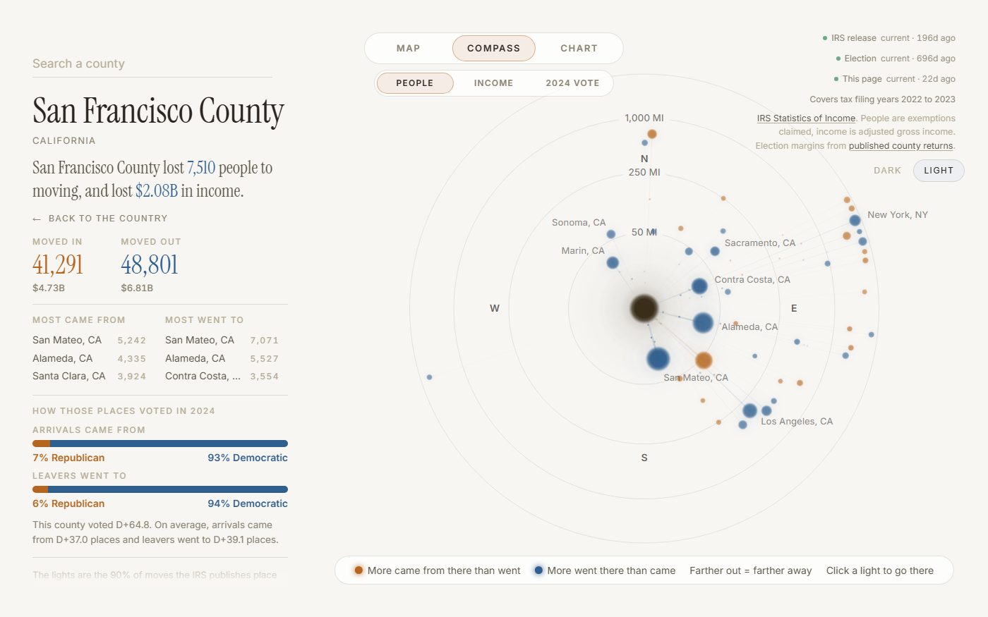
Pick any of 3,144 counties and it becomes the center of its own solar system: every county it exchanges people with orbits it, positioned by true compass bearing and real distance, sized by how many people moved, colored by whether that place gained or lost. Beside it, one sentence says what happened, and two bars show how the places it drew people from voted in 2024 against the places it sent them to. One switch recolors the map and the compass by people, income or the 2024 vote, and a national chart puts every county on its 2024 margin against how much it grew or shrank from moving.
Limitation
The IRS only publishes flows above a disclosure threshold, so the drawn lines are usually 70 to 90 percent of a county's real movement, with the rest counted in the totals but not shown individually. The political reading describes the places people moved to and from, never how those people themselves voted, since the migration data and the election returns come from two files that were never joined at the individual level.